Website Redesign: Alexandria II
In Fall 2020, I took an Interaction Design and Usability Testing class taught by Jaime Levy. Each student did a semester-long project where they selected an independent brick-and-mortar store in their local city with an unresponsive website. Every week, we did assignment that led up to the final project, going through all the UX process (persona creation, user flows, etc -> prototyping). It was challenging and stressful three months, but I learned a lot. I’m excited to build on these UX skills that I learned for future work.
Background
Alexandria II is a metaphysical bookstore located in Pasadena, CA. Established in 1985, it is one of the oldest metaphysical stores in the local and greater Los Angeles area. Besides books, they also sell candles, crystals, jewelry, and more along with offering psychic readings.
I chose this store because of its long history in the Pasadena and the greater LA area. The store always intrigued me, having driving past it for years, but never gone in. I also wanted to do a bookstore because I like reading books.
Initial State
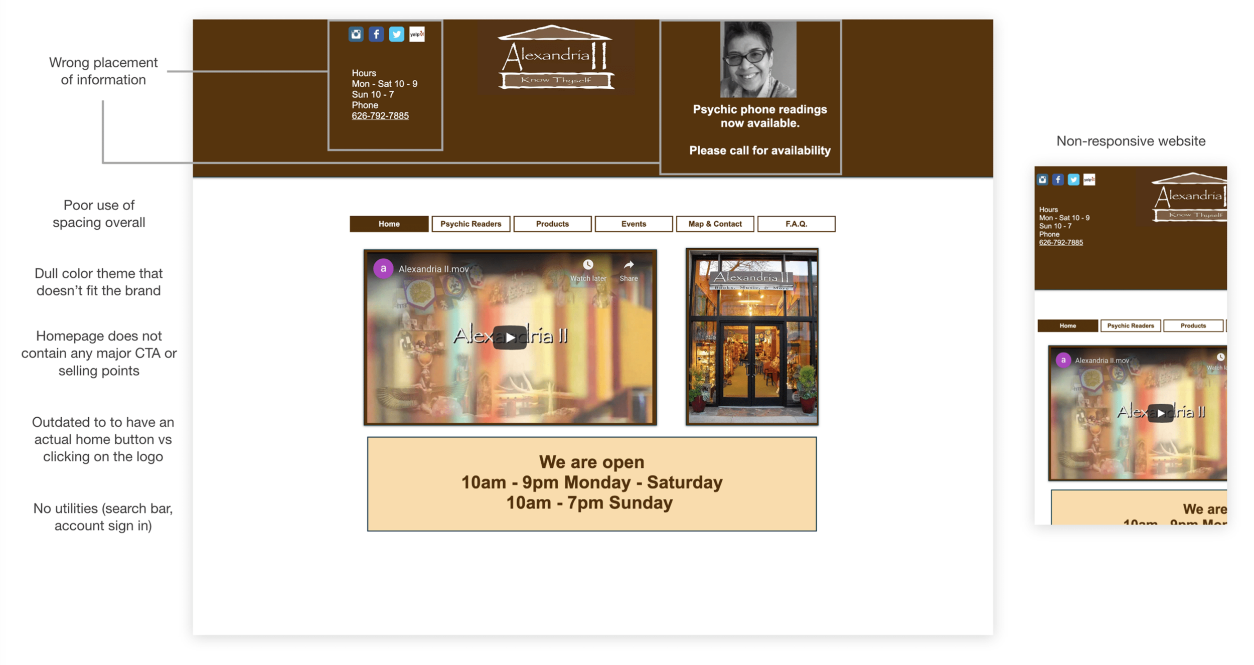
Current state (Screenshot September 2020)
Research
Before doing any design work, designers need to understand the users, their behaviors and needs as we are designing for them.
Persona Hypothesis
Through my research, I hypothesized the customers of the store would fall into two categories.
Regular: familiarity with metaphysicals and want to continue expanding their knowledge/collection of items
One-time: new to the metaphysicals and want to learn more and explore
User Interviews
I then came up with separate interview questions for regular and one-time customers. In total, I interviewed 6 people, 5 of them regular customers and 1 one-time customer.
Regular Customer
1) How often do you go Alexandria?
2) How often do you use metaphysical concepts in your life?
3) Are you interested in learning other areas of metaphysicals that you have not explored yet?
4) Do you think it would be helpful if they had an online store?
5) Have you booked their psychic readings before? If so, would it be helpful to schedule the readings online?
6) Have you attended any events before?
One-Time Customer
1) Why are you interested in the metaphysicals/spirituality? Are you exploring for fun or more serious?
2) What metaphysical educational sources have you looked into before?
3) How did you hear about Alexandria?
4) Did you check the Alexandria website to see what they offered (items, services, about, etc)?
5) Would it be helpful if there are educational sources on the website (i.e. FAQs, blogs)?
6) Would you be willing to spend money on getting psychic readings?
Primary Persona
After conducting my interviews for both types of customers, I decided to focus on the regular customers as they had a lot of unfilled needs that can be catered first.
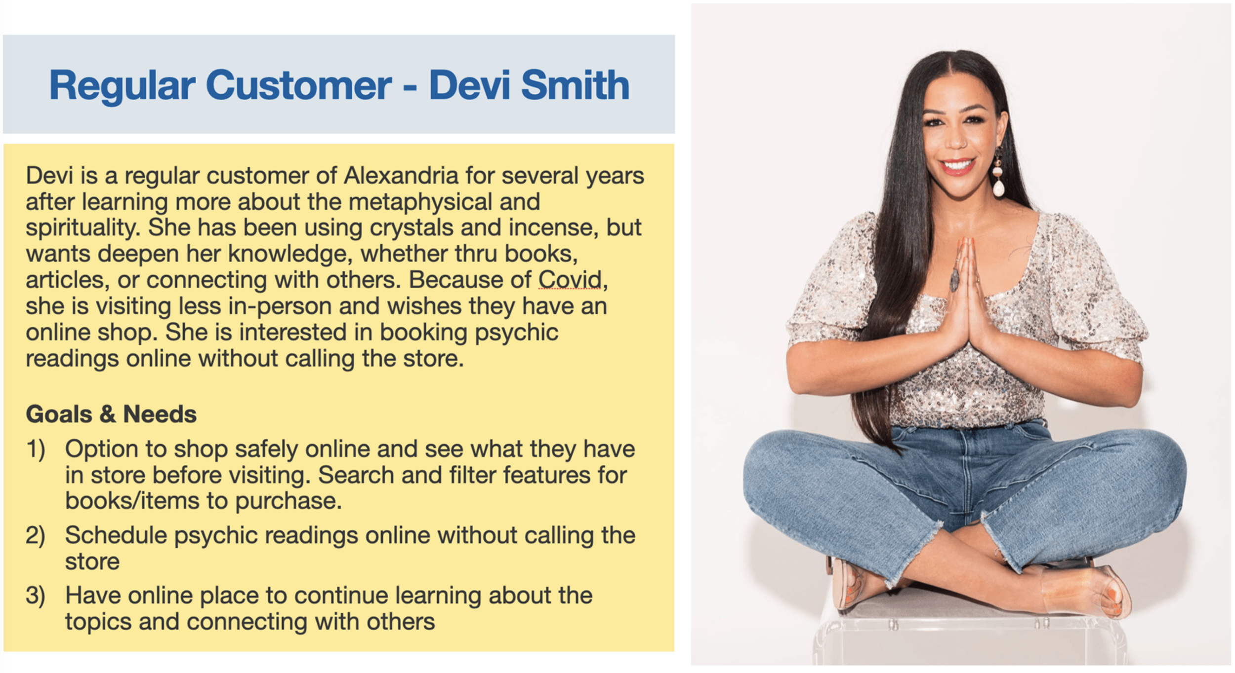
User Stories
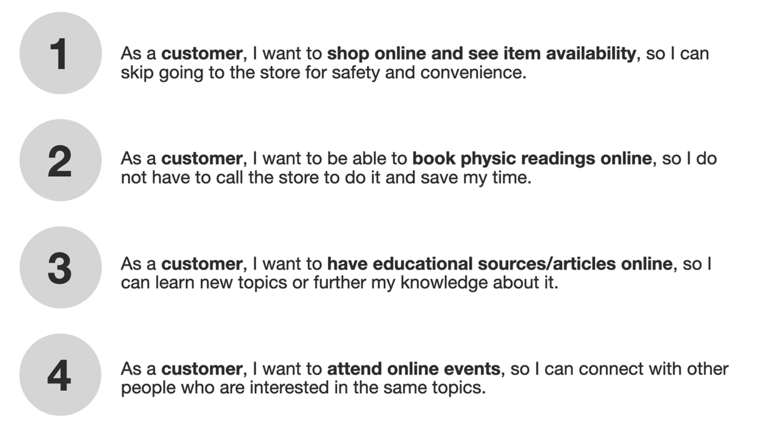
From my research, I concluded there are four main actions the primary persona will go through when using the website.
Feature List
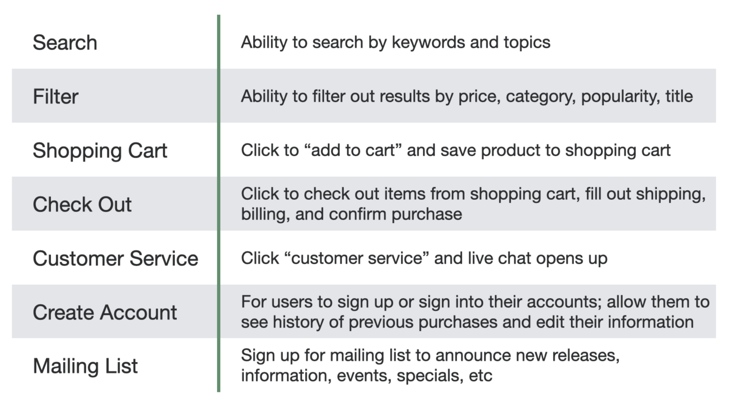
Based on the goal-directed user context user scenario, user stories, and user cases, the website should prioritize these features below.
Site Map
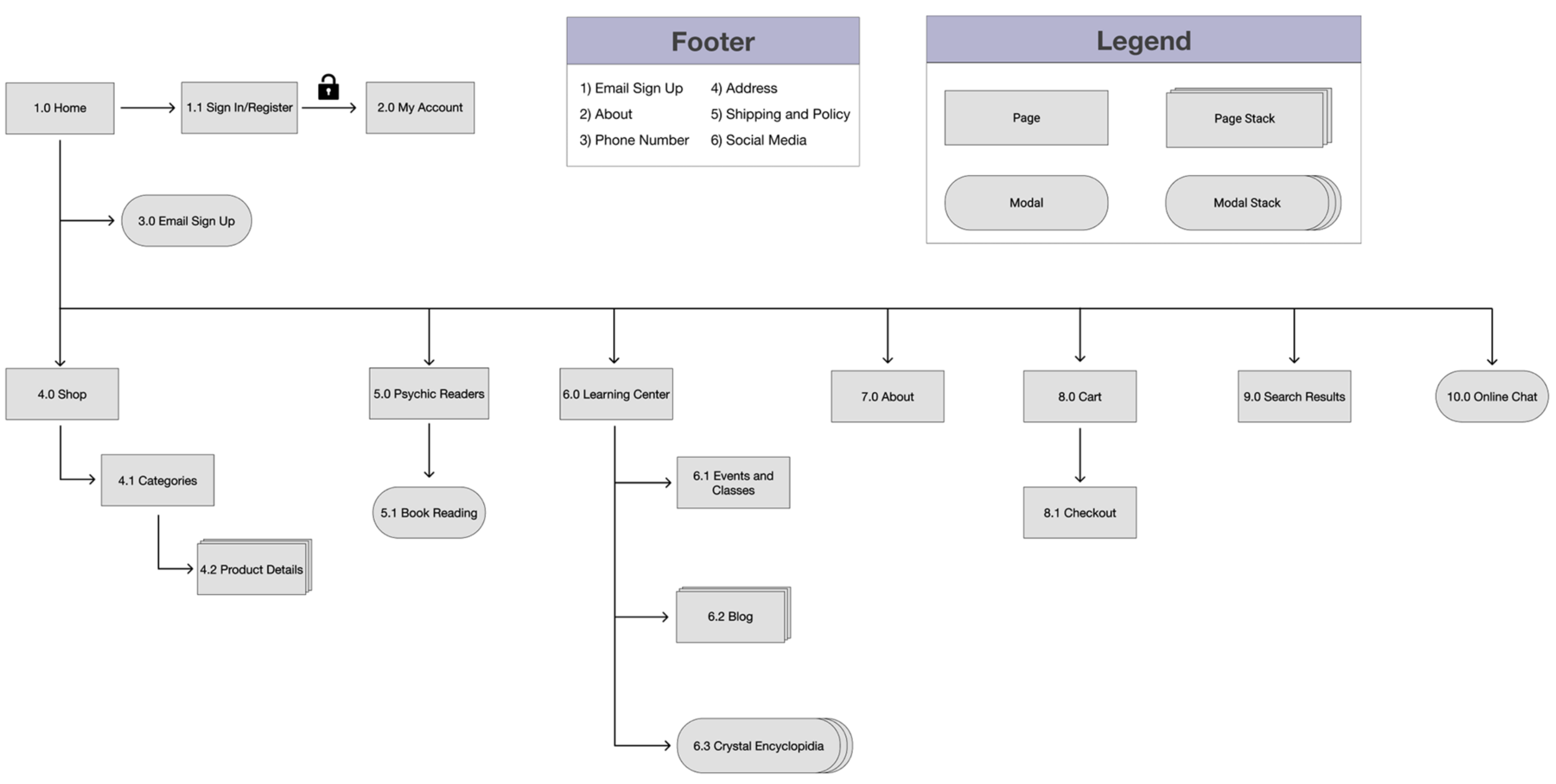
After analyzing the needs of the primary persona and important features needed for the website, I started thinking about the user flow structure. This led me to build out the site map to how to best lay out the information using Figma.
Design
Wireframe
Using Adobe XD, I created the low fidelity layout of the desktop version first and then moved on to the responsive version, which was used for the rest of the project. I looked at various e-commerce and bookstore websites for inspiration, like Powell's Books, House of Intuition, and Away Travel.
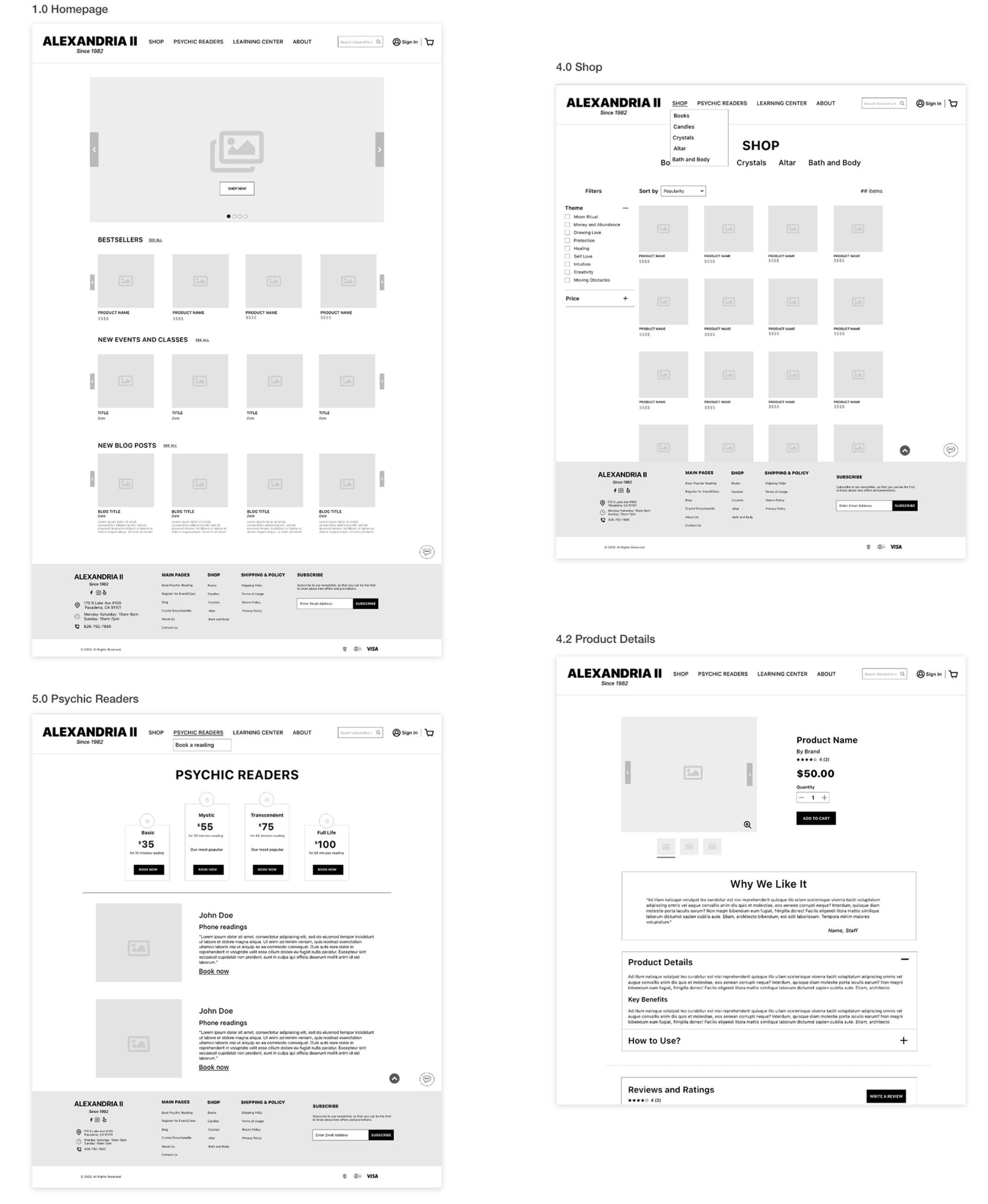
Desktop wireframes for some of the top-level pages.
Visual Design
As I was finishing my wireframes, I started thinking about the color palette, fonts, and icons. I looked at competitor websites in this category and noticed how they tend to use dark or drab colors that made the website unattractive and hard to use. I wanted a palette that warm, welcoming, and up-to-date with design trends.
The purple was used as the primary color because it reminded me of the crystal amethyst and its various shades of purple. I wanted a pop of color for the buttons so I chose this mellow warm yellow. It stands out without being too jarring. As for the green, I wanted to use it for secondary level functions, like chat or hover. The rest of the design used a combination of a dark gray and white to balance out the palette.

Wireframes from the final design.
Prototype
This was one of my favorite aspects of the project as I got to explore the potentials of XD. It is still considered the new kid on the block when it comes to design tools, but it has been catching up in popularity with Sketch and Figma. I like how XD is accessible for both Mac and PC users, access to the Adobe library content, has sleek UX/UI, and free! You can check out my prototype for the new Alexandria II responsive website here.
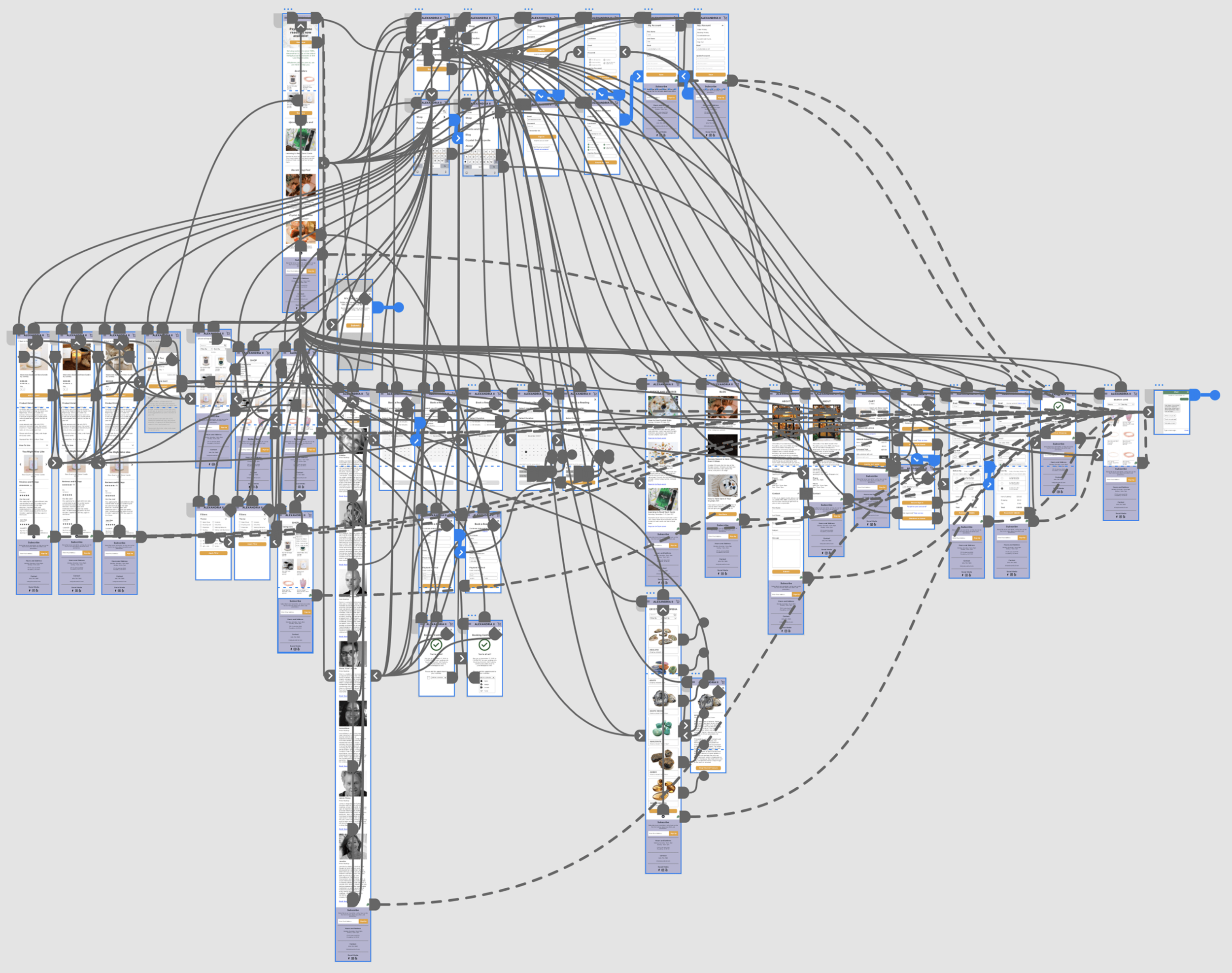
Screenshot of my prototyping process in XD.
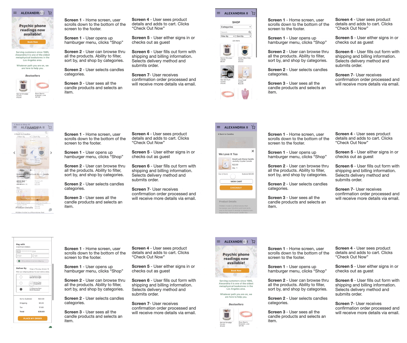
Script 1: Buying Candles
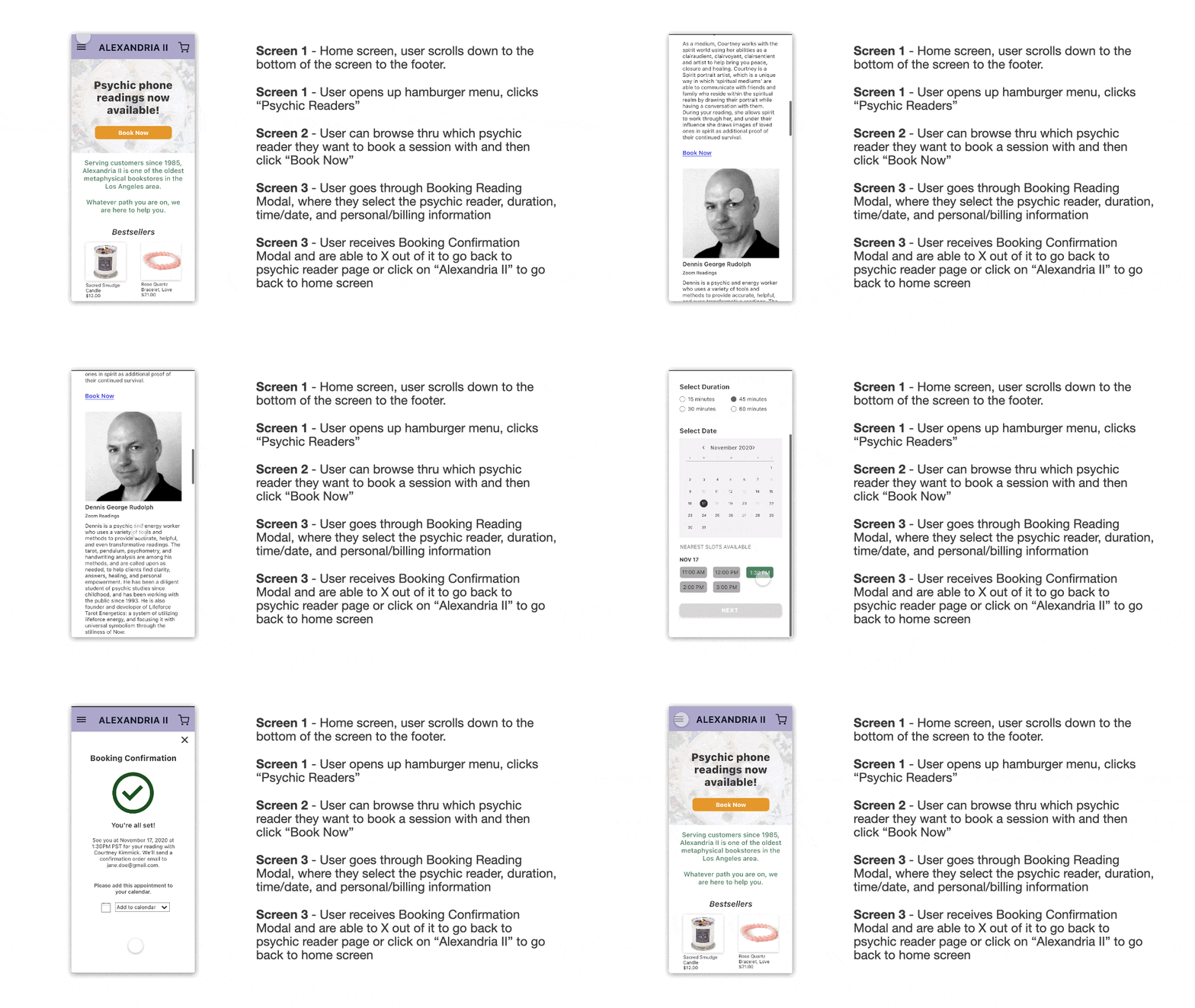
Script 2: Booking a Psychic Reading
Usability Testing
After completing the UX/UI of my design, I conducted usability testing to ensure that my design is meeting the needs of target users. I created a research plan and tested it with four participants who have bought something related to the metaphysicals within the past two years. The usability testing was done on UserZoom Go with their unmoderated feature.
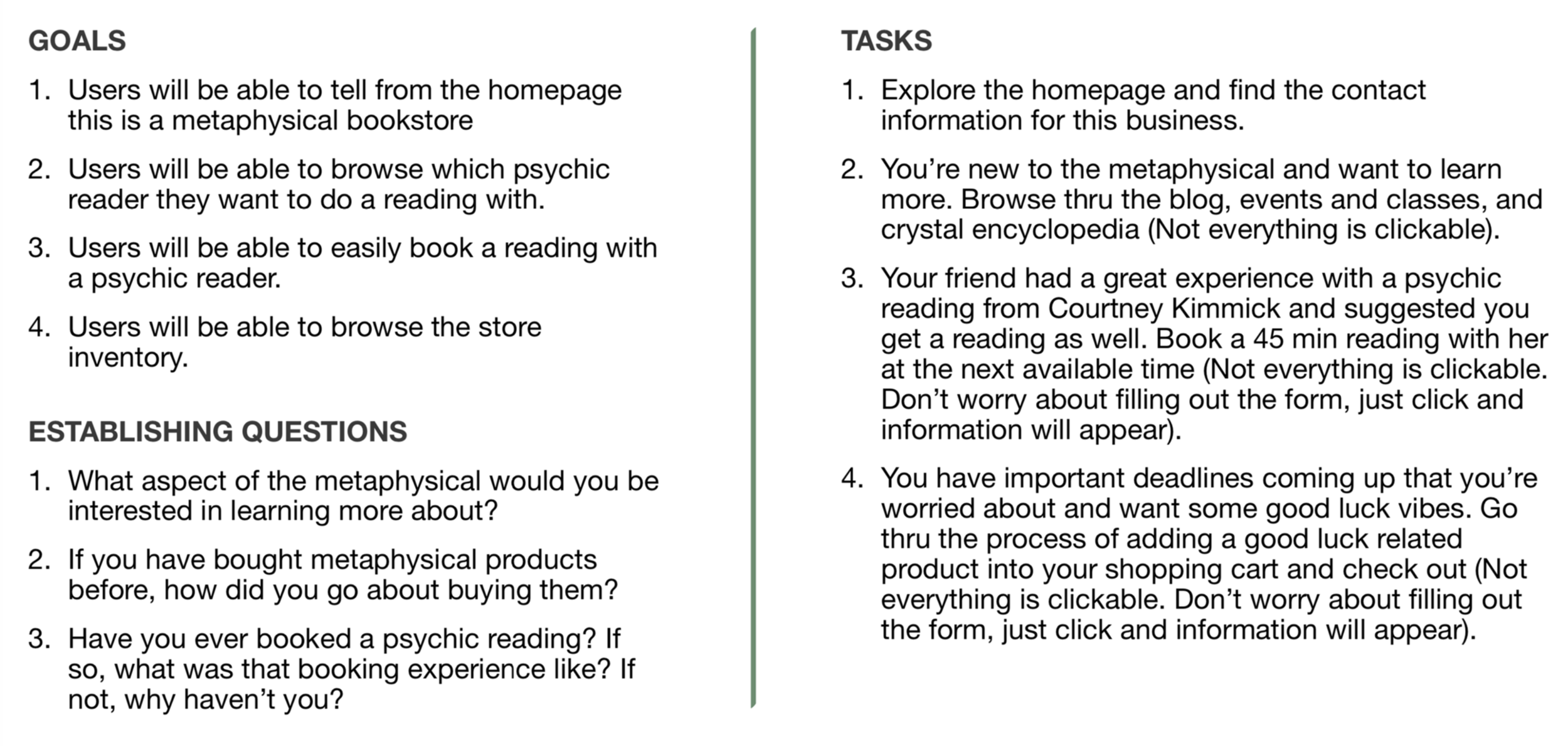
Research Plan
The plan lays out the goals, establishing questions, and tasks for the user testing.
Test Results
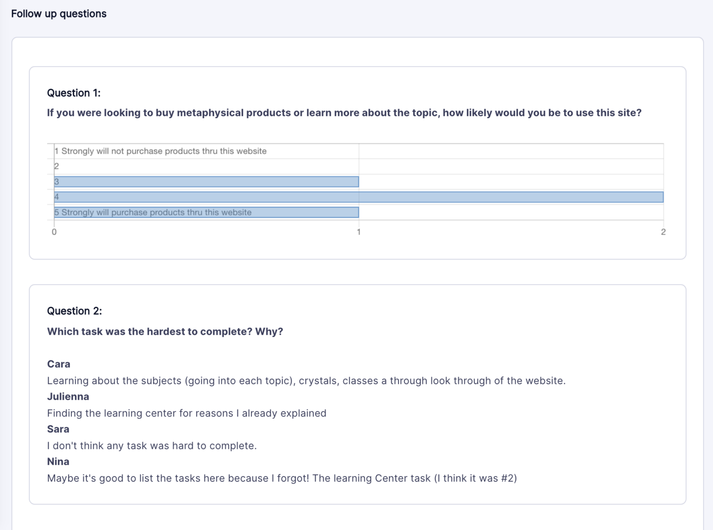
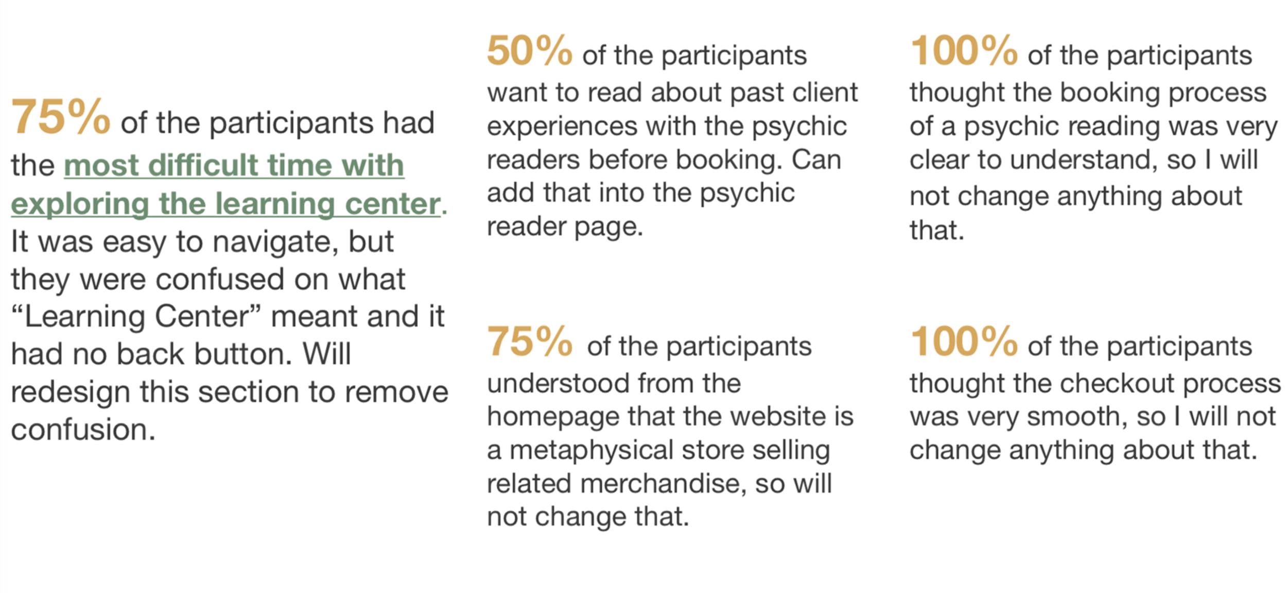
Most of the participants were able to get through my tasks easily, with the exception of Task 2. Reading the responses to Task 2 Questions, I found that all my participants were a bit confused with the section "learning center" and how to navigate that. In addition, one participant for the crystal encyclopedia section, did not realize they were able to click on the crystal to show more details about it. With Task 3 and 4, one of the participants for each task completed the task, but clicked finish on the wrong page.
You can check out the Highlight Reel of these tests here, where I specifically focused on Task 2. Below, I have included screenshots of my results.
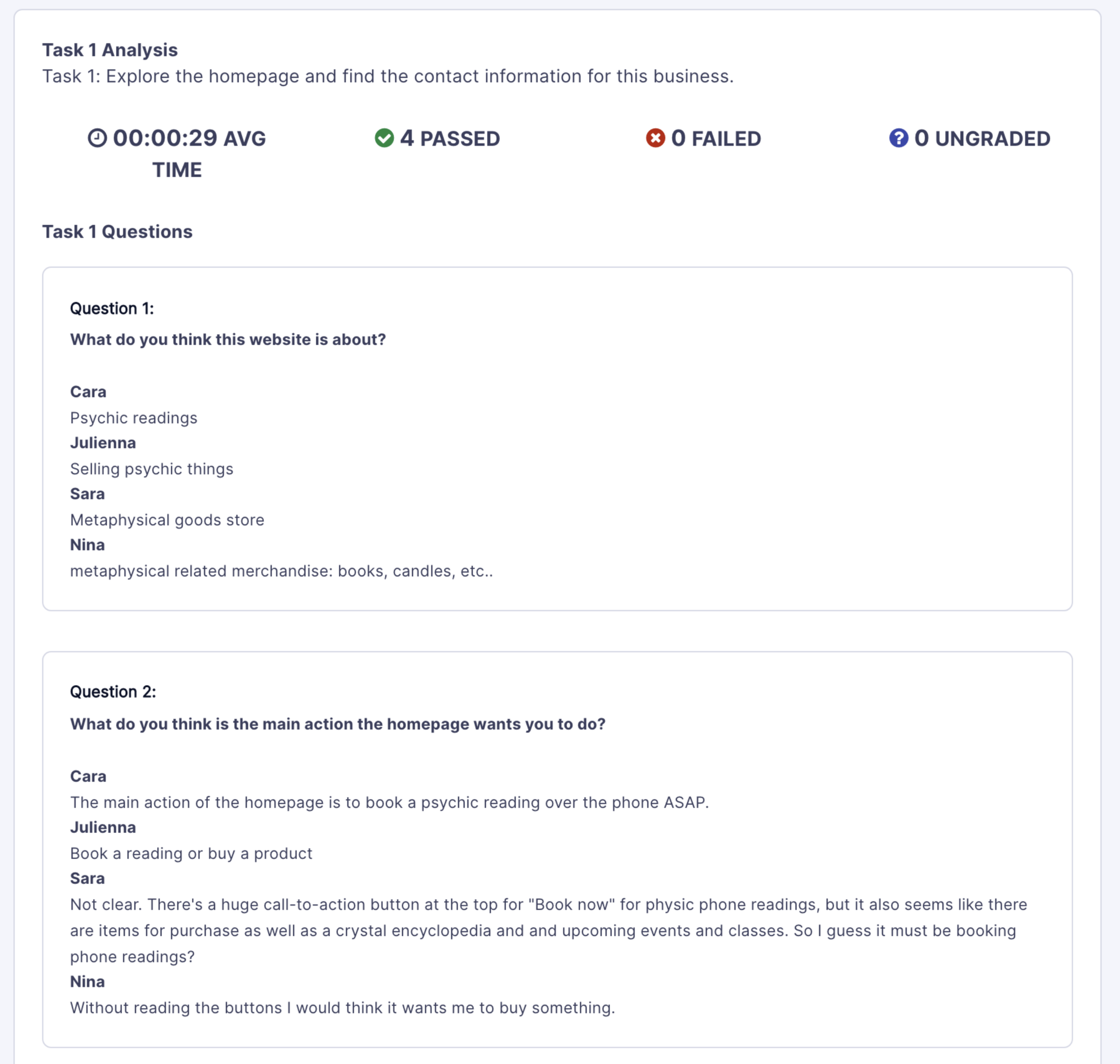
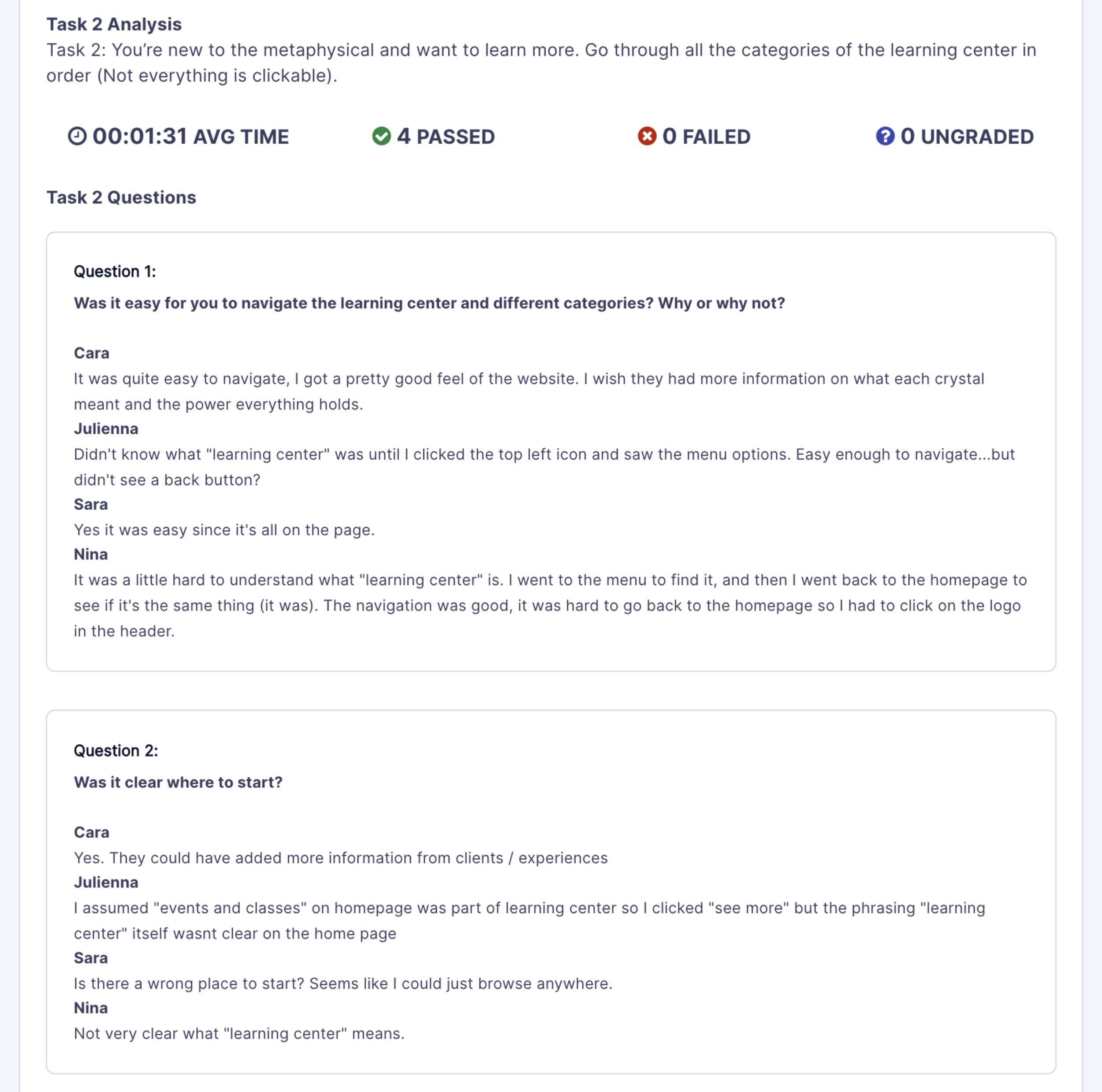
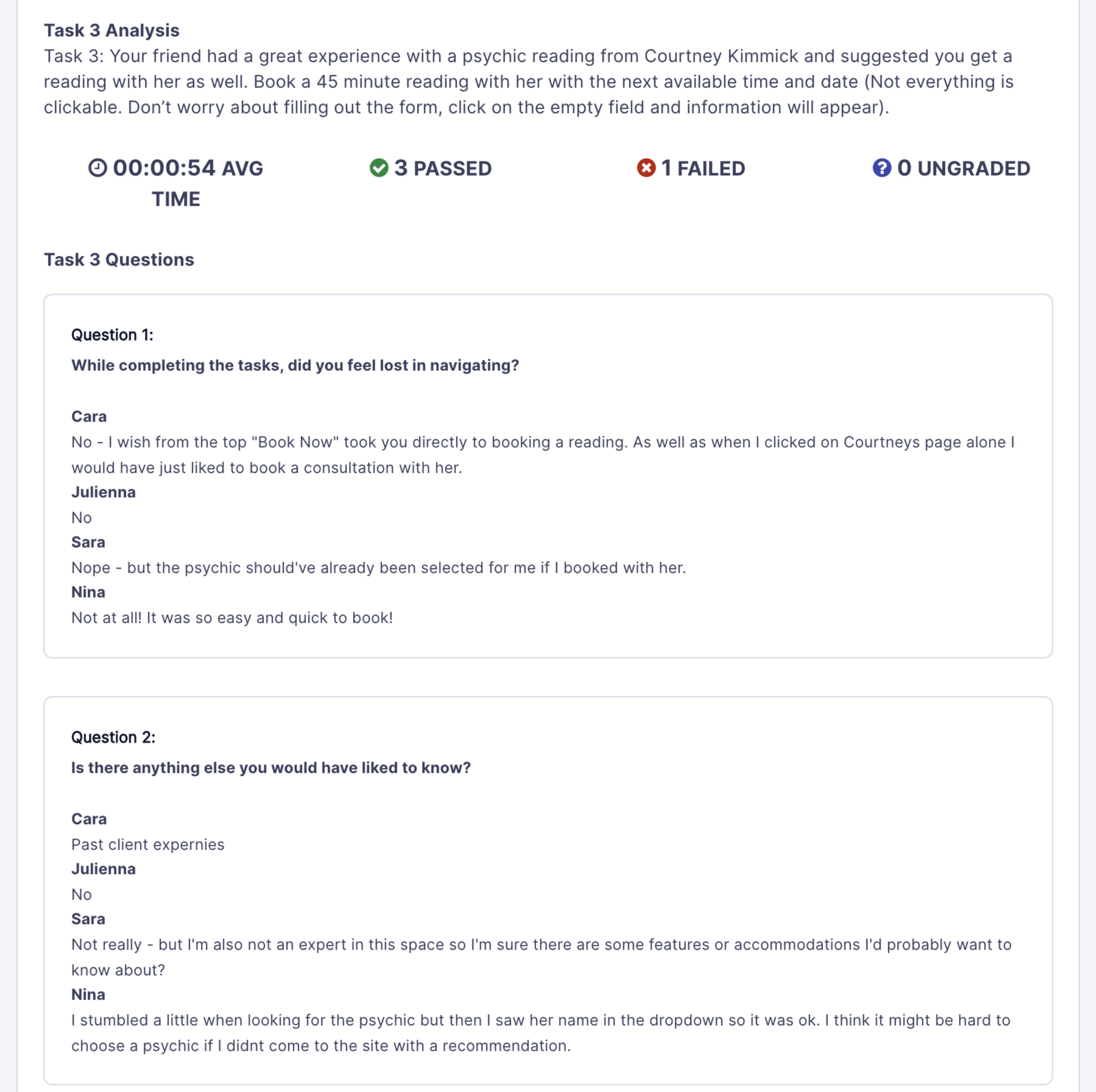
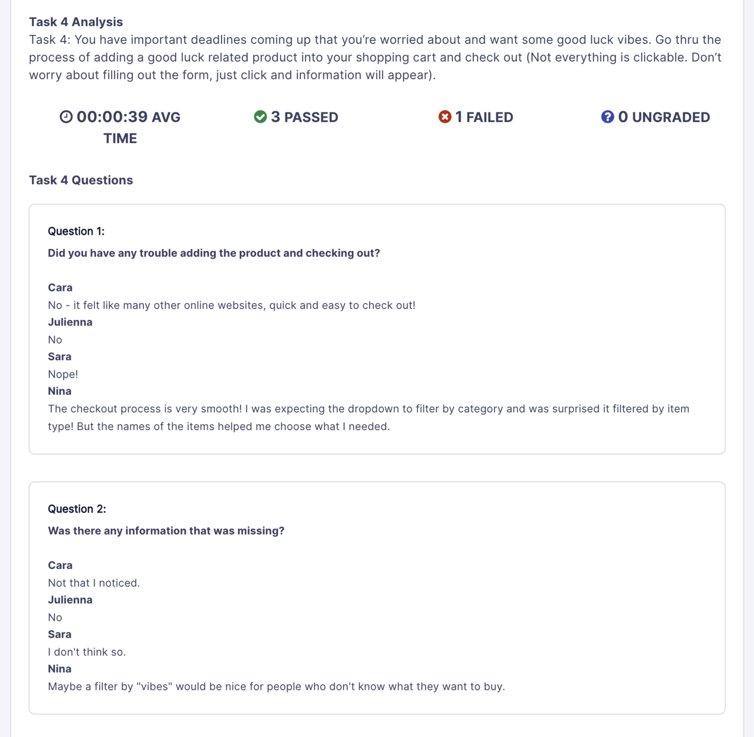
After looking at the video footage and testing results, I summarized my findings into a few key points.
Improvements
Based on the feedback and findings, I decided to make some updates and changes to my design. You can view my final prototype here.
Homepage
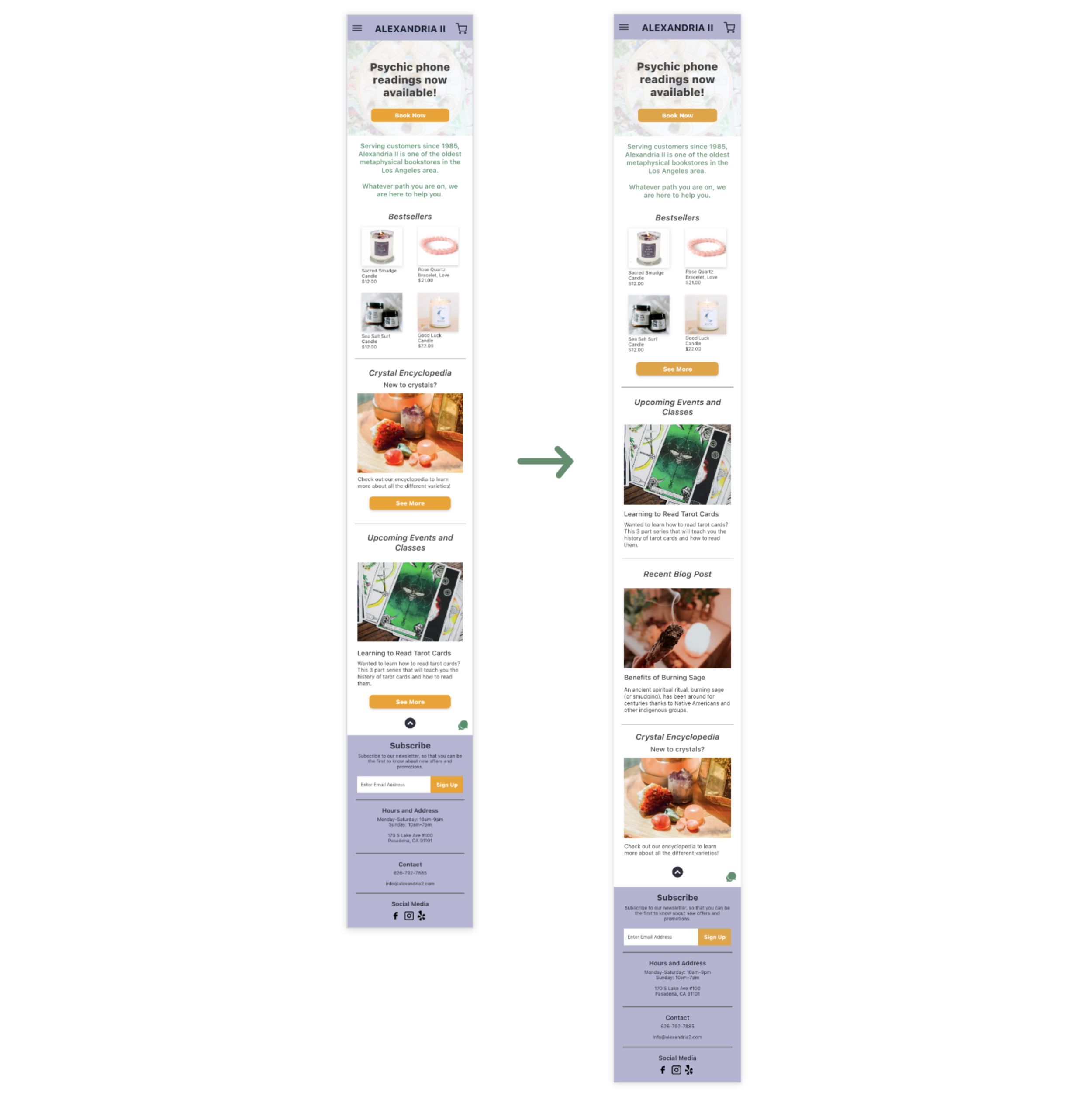
While none of my participants did not have trouble navigating my homepage, one participant did point out that my CTA was unclear as there were too many buttons. I decided to clean that up and just have two CTA buttons, "Book Now" for psychic reading and "See More" for the Bestsellers.
Removing the Learning Center
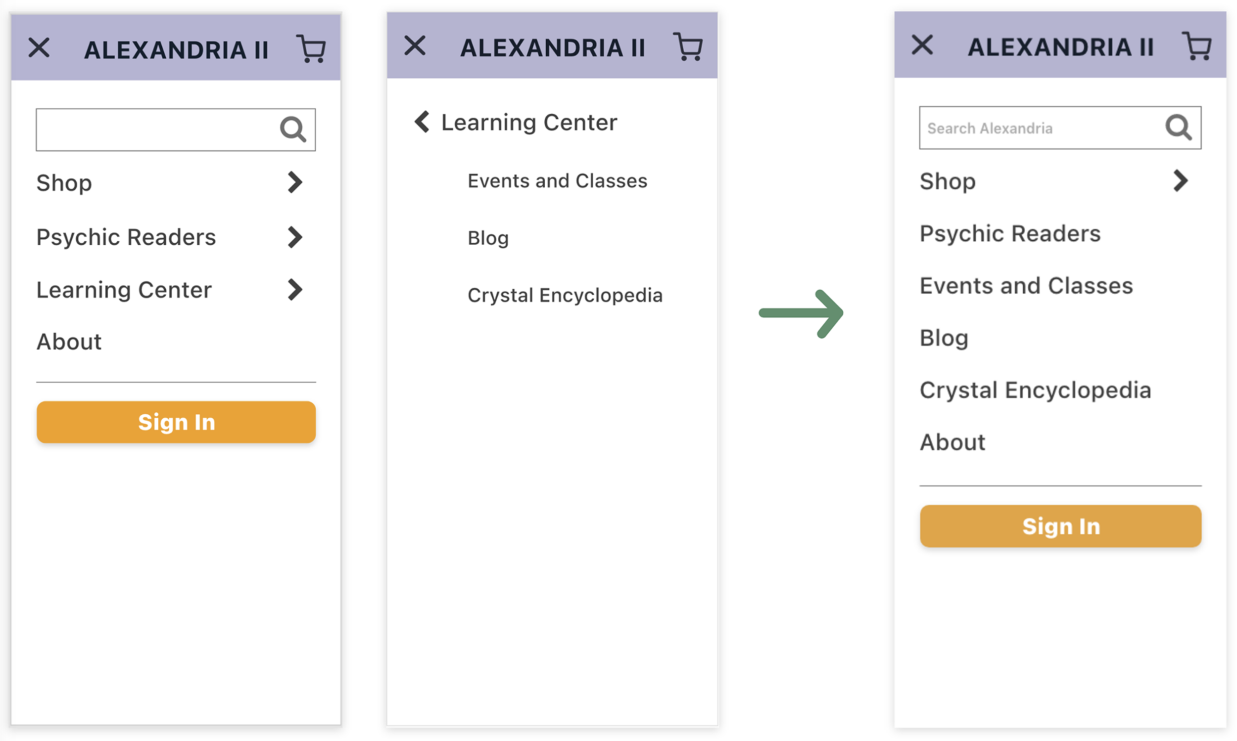
This one I had the most trouble with because I was not sure how to go about fixing it. After consulting with the professor and classmates, I decided to just completely remove the category and making each of the three subcategories (events and classes, blog, and crystal encyclopedia) into main categories. It resulted in a minor change in the hamburger menu design.
Crystals More Clickable
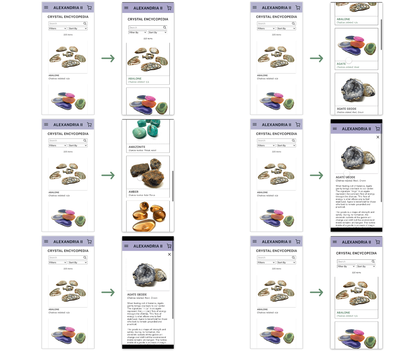
The original crystal encyclopedia just had a background shadow on the images. I decided to add a hover effect on name of the crystal and chakras to indicate to users that you can click on it. In addition, also added a border for each crystal to make it even clearer.
Reflection
Thank you to my professor, TA, peers, and friends for their feedback throughout the semester. Your feedback was invaluable.
This project challenged me in so many ways over three months, from beginning to end. It was an incredibly eye-opening experience to learn about the full design process and think more about what makes good design. One thing I would have differently is creating a logo for the store as it can help strengthen the branding. Nonetheless, now that I have the foundational skills, I cannot wait to continue expanding on them with future UX work.
My final version of the prototype can be found here.